Successful Amazon affiliate websites share four structural habits: one named buyer, a pillar hub that owns the category term, comparison and single-product money pages kept current, and disclosure plus privacy policy placed before the first affiliate link.

What Counts as a "Successful" Amazon Affiliate Website (and the 4 Traits Every Example Shares)
Judge examples by what survives, not by a screenshot of a traffic spike. The sites worth copying move a reader from an informational search to a priced recommendation in two clicks or fewer. That path is the product.
Four traits repeat across every durable example:
- A named buyer, not a topic. "Home baristas with a $400 ceiling" beats "coffee lovers."
- A hub page that owns the category term. One URL links down to every comparison and review beneath it.
- Money pages that stay current. Each review carries a last-checked date, a pros and cons block, and an honest reason to skip the product.
- Compliance plumbing. Disclosure above the first link, a published privacy policy, and no scraped prices or star ratings.
AAWP reports that Amazon Associates approval is conditional: a new account must generate at least three qualifying sales within 180 days to stay active. That single rule explains the shape of the sites you admire. Essay-first blogs with no comparison pages rarely clear the bar, so the examples still standing are the ones that shipped commercial pages early.
Count commercial pages before you count posts. A 300-post site with four buying guides is weaker than a 30-page site where eight pages carry a comparison table.
6 Amazon Affiliate Website Examples, Teardown by Structure
Six structural patterns cover nearly everything you will find in the wild. They differ in traffic source and page count, not in the underlying funnel.
| Example type | Load-bearing structure | Primary money page | Main failure mode |
|---|---|---|---|
| Niche review site | 1 pillar hub, 5–10 comparisons, 20+ single-product reviews | "Best X for [buyer]" comparison | Thin duplicate reviews of the same ASINs |
| Topic hub (magazine style) | Category silos, each with its own hub and editor | Seasonal gift and upgrade guides | Silos that never link to each other |
| Deal site | Fast-publishing feed plus evergreen category landing pages | Time-boxed deal roundups | Manual price claims going stale |
| Creator storefront | Short video or photo library pointing to a curated list page | Curated "what I use" list | No owned site, so no search traffic |
| Tool/calculator site | Input tool first, recommendations after the result | Post-calculation product shortlist | Tool ranks, product links sit below the fold |
| Multi-marketplace site | Same reviews localized per storefront with geo-aware links | Localized comparison tables | Wrong-country links and wrong rate assumptions |
The multi-marketplace pattern pays off only when the category earns well abroad. The Associates Program Standard Commissions Schedule on Amazon.sg shows Singapore paying 12.00% on Beauty, Watches, Jewelry and Luxury Beauty, which is a different economic picture than the same page sees in the U.S.
Creator storefronts look like the easiest example to copy and are the most fragile. You rent the audience, the feed decides distribution, and nothing compounds in search. Pair a storefront with an owned hub if you want both.
The Shared Page Architecture: Pillar Hub, Comparison Table, Single-Product Review, Buyer-Intent FAQ
Strip any strong example site and you find the same four layers stacked in the same order.
- Pillar hub. Targets the bare category term, explains how to choose, and links to every page below. No affiliate links in the first screen beyond one top pick.
- Comparison page. Targets "best [product] for [buyer]" and opens with a picks box: winner, budget option, upgrade. The table carries four or five decision columns, never twelve.
- Single-product review. Targets the brand and model name, answers "should I buy this specific unit," and names who should not buy it.
- Buyer-intent FAQ. Targets questions with a purchase attached — sizing, compatibility, warranty, refills — and links sideways into the comparison page.
Linking direction matters more than link count. Reviews link up to the comparison page, the comparison page links up to the hub, and the hub links down to everything. A reader landing on any one of those four layers reaches a money page without using the menu.
Keep one money page per buyer segment. Three near-identical "best espresso machine" pages split your internal links and your rankings for no gain.
Content Patterns That Actually Convert: Disclosure, Above-the-Fold Picks, and a Short Click Window
The click window after someone leaves your page for Amazon is short, so the job of your page is to produce a confident click early, not a long read. Put the top pick, a one-line reason and the button in the first screen on mobile. Everything else supports that decision.
Alliance Virtual Offices notes that a visible FTC-compliant disclosure and a published privacy policy are baseline requirements for an Amazon affiliate site, which is why every credible example carries the standard "As an Amazon Associate" line. Place it above the first affiliate link, not in the footer.
Patterns that repeat on converting pages:
- A three-option picks box: best overall, best budget, best upgrade.
- A "skip this if" line in every review, written before the pros.
- Specs that answer objections — tank size, cable length, replacement part availability — rather than full spec dumps.
- Repeated links at the end of each product block, since readers decide at different scroll depths.
- No price text in the body; let Amazon’s own widgets and the destination page carry pricing.
Write the recommendation first and the introduction last. The intro exists to confirm the reader is in the right place, in about two sentences.
Scenario: Turning a 40-Post Coffee Gear Blog Into a Hub-and-Spoke Site
Picture a four-year-old coffee blog with 40 published posts, no hub page, and affiliate links scattered mid-paragraph. Eleven of those posts chase variations of the same "best espresso machine" query. Disclosure sits in the footer only.
| Before | After restructure | |
|---|---|---|
| Pillar hubs | 0 | 1 |
| Comparison pages | 0 | 6 |
| Single-product reviews | 18 (unstructured) | 18 (templated) |
| Informational support pages | 0 | 2 |
| Thin posts | 9 | 0 (301-redirected) |
| Live URLs | 40 | 27 |
The arithmetic stays clean: 18 reviews keep their URLs, 11 overlapping posts merge into 6 comparison pages, 9 thin posts redirect to the nearest comparison page, and 2 become support content on brewing ratios and descaling.
Amazon’s official U.S. Associates rate card pays 4.50% on Kitchen, which makes this niche workable on volume rather than ticket size. Grinders, scales and kettles sit in the same bracket, so the comparison pages are grouped by buyer budget instead of by product type.
Workflow order: export the URL list, tag each post as review, comparison, support or thin, merge before you write, then build the hub last so it links to finished pages.
The Reproducible Teardown Procedure: Audit Any Amazon Affiliate Site in 45 Minutes
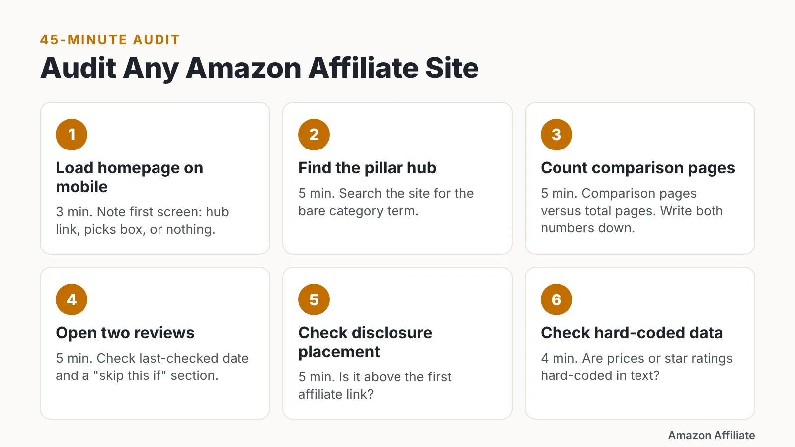
Budget 45 minutes and work in this order. Ten steps, on a phone first.
- (3 min) Load the homepage on mobile and note what appears in the first screen — a hub link, a picks box, or nothing.
- (5 min) Find the pillar hub. Search the site for the bare category term and see which page ranks.
- (5 min) Count comparison pages versus total pages. Write both numbers down.
- (5 min) Open two reviews and check for a last-checked date and a "skip this if" section.
- (5 min) Map internal links on one review: does it reach a comparison page without the menu?
- (5 min) Check disclosure placement relative to the first affiliate link.
- (4 min) Look for a privacy policy and an editorial or testing methodology page.
- (4 min) Check whether prices or star ratings are hard-coded in text.
- (5 min) Identify the buyer segment in three comparison titles. Vague titles signal weak targeting.
- (4 min) Note the traffic source mix implied by the content: search, newsletter, or social storefront.
Score each step pass or fail, then copy only the passes. A site can rank well and still fail steps 6 and 8, which makes it a ranking example rather than a structural one.
Run the same audit on your own site before you copy anyone.
Niche Economics: Choosing Categories Against Amazon’s Rate Card and Marketplace Differences
Category choice sets your ceiling before traffic does. Amazon’s official U.S. Associates rate card pays a fixed 10.00% on Luxury Beauty, Luxury Stores Beauty and Amazon Explore, and 5.00% on Digital and Physical Music, Handmade and Digital Videos.
| Marketplace | Category | Rate |
|---|---|---|
| U.S. | Luxury Beauty, Luxury Stores Beauty, Amazon Explore | 10.00% |
| U.S. | Digital and Physical Music, Handmade, Digital Videos | 5.00% |
| U.S. | Physical Books, Kitchen, Automotive | 4.50% |
| U.S. | Watches, Jewelry, Luggage, Shoes, Handbags | 4.00% |
| U.S. | PCs and PC components | 2.50% |
| U.S. | Televisions, digital video games | 2.00% |
| Singapore | Beauty, Watches, Jewelry, Luxury Beauty | 12.00% |
| Singapore | Apparel, shoes, furniture, luggage | 10.00% |
| Singapore | Amazon Fresh, Baby, Grocery, Pantry Food & Drink | 0.00% |
| Canada | Luxury Beauty | 10.00% |
| Canada | Pet Food & Supplies | 9.00% |
| Canada | Jewelry, Luggage | 7.00% |
Amazon’s U.S. schedule pays only 2.00% on televisions and digital video games, which is why so many tech example sites quietly pivot into accessories. Amazon Canada’s schedule pays 9.00% on Pet Food & Supplies, so an identical pet site earns differently per storefront.
Two traps deserve attention. The Associates schedule on Amazon.sg lists Amazon Fresh, Baby, Grocery and Pantry Food & Drink at a fixed 0.00%, and Amazon’s Onsite Associates Program pays 3.00% on Furniture, Home, Home Improvement, Lawn & Garden and Pets Products for direct qualifying purchases — materially less than the standard card.
Compliance and Survival Checklist
The fastest way to lose an example site is administrative, not editorial. Work through this list before you chase rankings.
- Disclosure visible above the first affiliate link on every page, including the homepage.
- Published privacy policy covering cookies and affiliate tracking.
- No hard-coded prices, star ratings or review counts pulled outside approved tools.
- Original product descriptions rather than copied Amazon bullet text.
- Links localized to the correct marketplace for the reader.
- A plan to reach the first qualifying sales inside the trial window.
AAWP reports that a new Amazon Associates account must generate at least three qualifying sales within 180 days to stay active, which argues for publishing two comparison pages before you publish ten essays. Alliance Virtual Offices notes that a visible FTC-compliant disclosure and a published privacy policy are baseline requirements for an Amazon affiliate site.
FTC disclosure guidance applies to U.S. advertisers and endorsers; other jurisdictions, including the UK and EU, run their own advertising rules, and Amazon’s Operating Agreement terms vary by marketplace. Check the agreement for each storefront you join.
This article is general information, not legal advice.
Frequently asked questions
Do I need my own website to be an Amazon affiliate?
No, creator storefronts and social accounts qualify as approved placements, but an owned site compounds search traffic in a way a feed cannot. Either route still faces the same activation rule: AAWP reports a new account must generate at least three qualifying sales within 180 days to stay active.
Which categories make the best Amazon affiliate website examples to copy?
Pick categories where volume or rate works in your favor. Amazon’s U.S. rate card pays 4.50% on Kitchen and Physical Books but only 2.00% on televisions and digital video games, so a kitchen gear site with steady repeat purchases often beats a high-ticket TV site on actual earnings.
How many pages does a site need before it looks like these examples?
Structure matters more than volume. One pillar hub, four to six comparison pages and roughly fifteen to twenty single-product reviews gives every reader a two-click path to a money page, which is the pattern that repeats across durable affiliate sites regardless of total page count.
Should I build one site for all Amazon marketplaces?
Only if the category pays well in each storefront. The Amazon.sg schedule pays 12.00% on Beauty, Watches, Jewelry and Luxury Beauty while listing Amazon Fresh, Baby, Grocery and Pantry Food & Drink at 0.00%, and Amazon Canada pays 9.00% on Pet Food & Supplies.
Where exactly should the affiliate disclosure appear?
Place it above the first affiliate link, visible without scrolling on mobile, on every page that carries links. Alliance Virtual Offices notes that a visible FTC-compliant disclosure and a published privacy policy are baseline requirements, which is why credible example sites carry the standard Associate line.
Sources
- Standard Commission Income Rates — Amazon Associates Central
- Amazon.com Associates Central — Help (Standard Commission Income Rates)
- Associates Program Standard Commissions Schedule — Amazon.sg
- Associates Program Standard Commission Income Statement — Amazon.ca
- Onsite Commission Income / Direct Qualifying Purchases — Amazon Associates Central
- What Are the Amazon Affiliate Requirements in 2026? — AAWP
- Amazon Affiliate Requirements 2025: What You Need to Qualify — Alliance Virtual Offices
Written with AI assistance and fact-checked against the sources cited above before the Amazon Affiliate Editorial Team published it.